Vybe Studio — Music Distribution Platform
Sixteen-page distribution platform site with three pricing tiers, a language layer and live currency conversion.
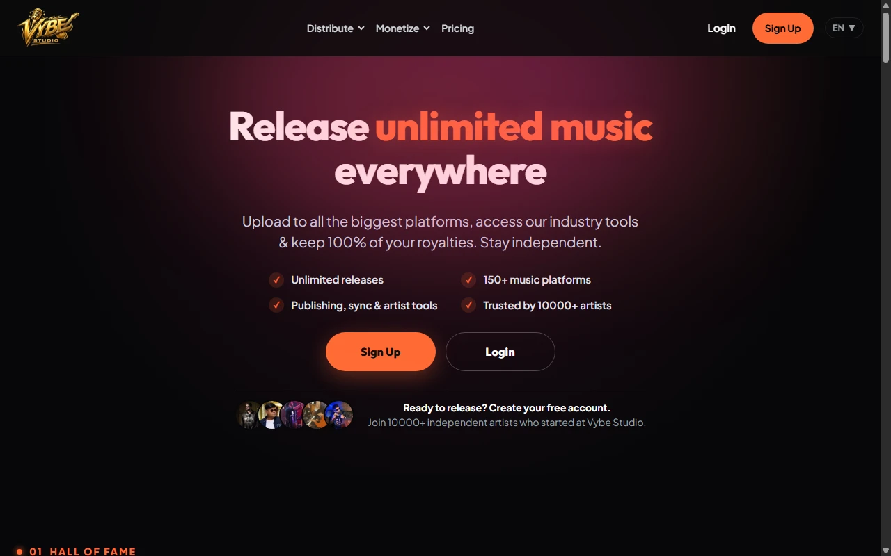
The Problem & Business Context
Vybe Studio distributes independent artists to Spotify, Apple Music, YouTube Music, TikTok, JioSaavn and 150+ other stores, and lets the artist keep 100% of the royalties.
Core Challenge: The offer was wide — unlimited releases, publishing, sync licensing, Content ID, royalty splits, pre-save links — and a single scrolling page could not carry all of it. Artists needed the pitch in one place and the detail on its own page, without the site turning into a maze.
The Solution & Deliverables
A hub-and-spoke structure: one home page that argues the case in five numbered sections, with dedicated pages behind every service and every question an artist asks before paying. Pricing sits early on the page rather than buried at the bottom, because the plan tier is the decision the visitor came to make.
Key Architecture & Design Decisions
01.Numbered sections instead of a flat scroll
Hall of Fame → Pricing → Monetise → Distribute → Grow. The visitor always knows where they are in the pitch and how much is left.
02.Prices shown in the artist’s terms
Plan prices render converted at the current rate, with an explicit line stating the charge happens in Indian Rupees — no surprise at the payment step.
03.A translation layer built in from the start
Copy is served through an i18n layer, with pricing strings handled separately, so a new language does not mean rebuilding the pages.
04.Proof by numbers, artist by artist
The roster shows each artist with their stream count rather than a generic logo wall — the number is the credential in this market.
Measurable Results & Impact
- [FILL: sign-ups or paid plans per month since launch]
- [FILL: which plan tier converts best, if you have the data]
- Publishing, sync, Content ID and royalty questions each have a page to link to, so the same answers are not retyped in support chats.